Driver performance (Insight)
See your fleet's on-time rate, total deliveries, toll fees, fuel costs and per-driver ranking, by day, week or month.
Where to find it: Insight in the left rail.
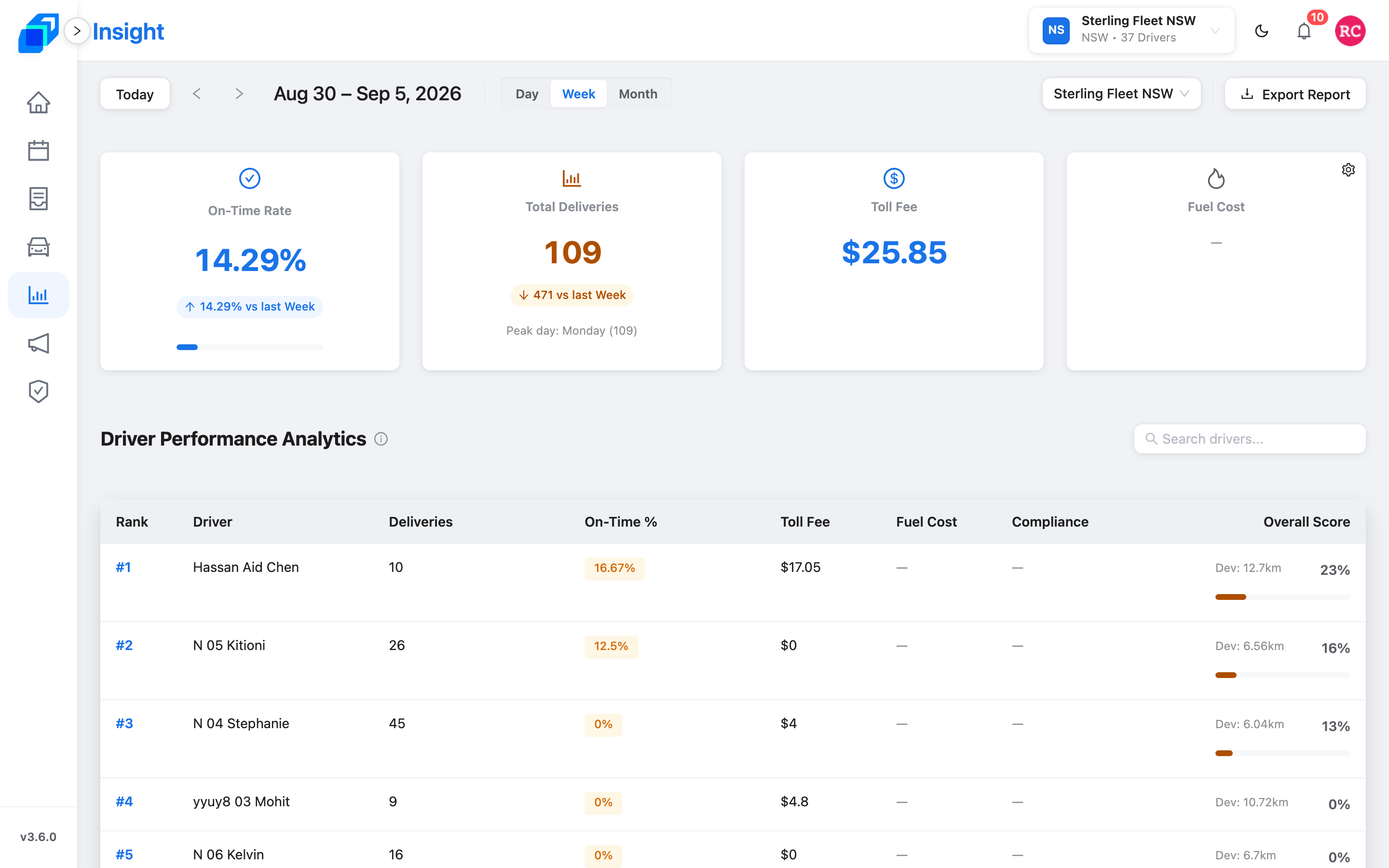
Pick your fleet
The fleet picker sits at the top right of the toolbar, beside Export Report. It reads Select Fleet until you choose one, then shows the fleet name. Start typing to search a long list.
The dashboard reports one fleet at a time, so switch the picker to compare fleets.
Choose your date range
The dashboard has three views. Pick one.
Day
Shows one day's totals and costs. There is no trend chart, because a chart needs at least two days of data. The toolbar says the same thing: Daily is the smallest unit — switch to Week or Month for a trend.
- Click Day in the toolbar
- Click the left or right arrow beside Today to move back or forward one day
- Click Today to jump to today
Week
Shows this week's performance, with trend charts. Click any KPI card to see its day-by-day breakdown.
- Click Week in the toolbar
- Click the left or right arrow to see the previous or next week
- Click Today to jump back to this week
Month
Shows this month's performance, with trend charts. Click any KPI card to see its day-by-day breakdown.
- Click Month in the toolbar
- Click the left or right arrow to see the previous or next month
- Click Today to jump back to this month
Click the date label on the toolbar – it sits to the right of the two arrows – to open a calendar. What you pick follows the view you are in: one day in Day, one whole week in Week, one month in Month. There is no way to set an arbitrary start and end.
The label reads month first and carries the year – Sep 8, 2026 in Day, Sep 6 – 12, 2026 in Week, and September 2026 in Month. When a week spans two months it names both: Aug 30 – Sep 5, 2026.
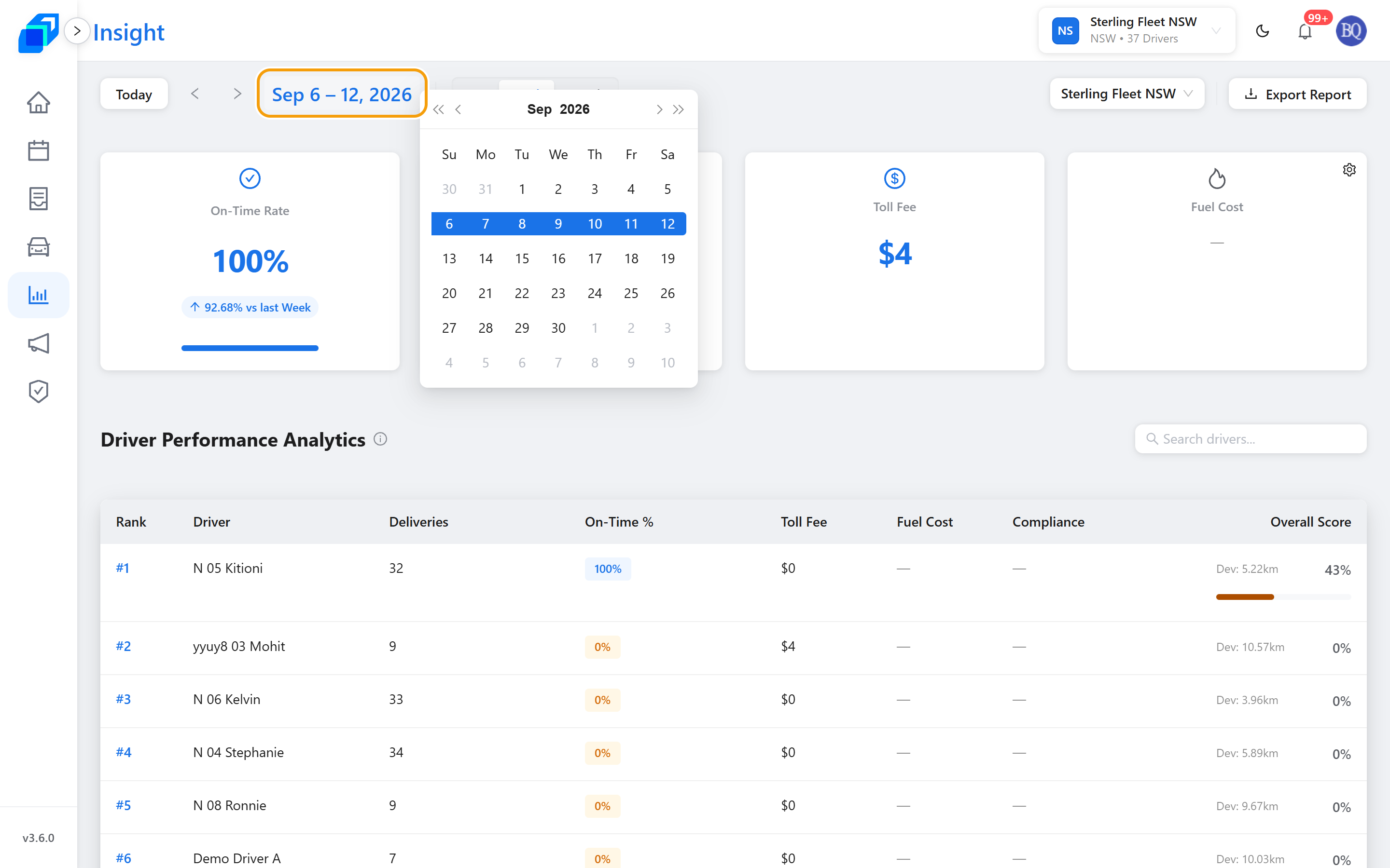
The date label shows the period you picked, the four cards along the top fill with figures, and the Driver Performance Analytics table below them lists your drivers ranked from #1 down.
Read the KPI cards
Four summary cards sit at the top of the page, each showing a percentage or a dollar amount. Three of them also carry a small badge comparing this period with the last one:
- A blue arrow marks a good change – the on-time rate or deliveries went up, or fuel cost came down.
- An amber arrow marks a change to watch – the on-time rate or deliveries dropped, or fuel cost went up.
On-Time Rate
The share of deliveries completed on time. Click the card to open a line chart of on-time performance, day by day, across your date range.
This card's badge follows the direction of change, not your on-time target. The 95% target colours the On-Time % column in the ranking table instead.
Total Deliveries
The number of deliveries completed. Click the card to open a line chart of delivery counts, day by day. The card also names your busiest day in the range.
Toll Fee
The total estimated toll across every delivery in the range. Click the card to open a line chart of toll costs, day by day. This card carries no comparison badge, because a toll figure has no good or bad direction.
Fuel Cost
The total estimated fuel spend, in Australian dollars. Click the card to open a line chart of fuel costs, day by day.
Manage fuel price: if you have permission, a gear icon sits in the corner of this card. It reads Manage Fuel Price. Click it to set or change the fuel prices for the fleet. SenditGo uses those prices to work out every estimated fuel cost.

Click the gear itself, not the card. The card is clickable too, and it opens the trend chart instead.
Fuel cost is worked out from distance, the vehicle's fuel use and the fleet's fuel price. Until a price is set, the card shows a dash instead of a figure.
Read the driver ranking
The Driver Performance Analytics table sits below the KPI cards and ranks your drivers by delivery performance.
| Column | What it shows |
|---|---|
| Rank | The driver's position – #1 is the top performer |
| Driver | The driver's name |
| Deliveries | Deliveries completed in the range |
| On-Time % | Share of deliveries on time – a blue tag above 95%, amber at 95% or below |
| Toll Fee | Estimated toll for this driver's routes |
| Fuel Cost | Estimated fuel cost for this driver's deliveries |
| Compliance | Compliance percentage, when the figure is available |
| Overall Score | A score from 0 to 100%, with a progress bar and the driver's route deviation in kilometres |
Sort the table: click the Deliveries or Fuel Cost heading to sort by that column. The other headings do not sort.
Find one driver: type a name in the search box above the table. The ranking narrows as you type.
Toll Fee, Fuel Cost and Compliance show a dash until their figures are available.
Open the trend charts
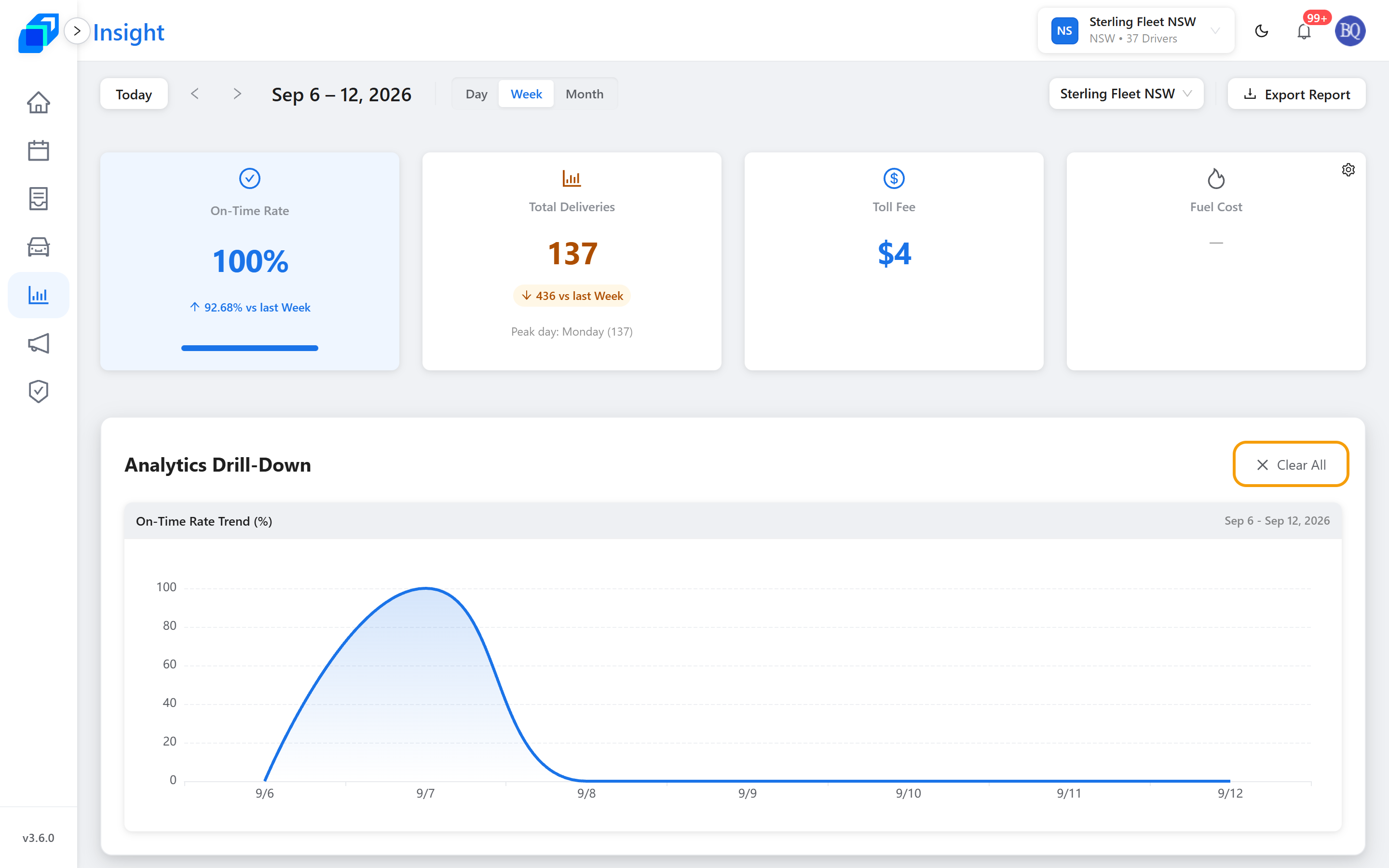
In Week or Month view, click any KPI card to open a line chart of its daily values across your range. The charts appear below the cards, under the heading Analytics Drill-Down.
- The horizontal axis is the dates in your range, written month first – 5/17 is 17 May.
- The vertical axis is the metric's value.
- Open several cards and each metric gets its own chart, side by side; the row re-flows to fit them.
Click a card again to close its chart, or click Clear All to close them all. In Day view the cards do not respond to clicks, because a single day has no trend to plot.
Export the ranking
Click Export Report at the top right to download the driver ranking as a CSV file. The file follows your current date range, your chosen fleet, and anything typed in the driver search box – clear the search box first if you want every driver.
For a large fleet the export takes a few seconds. The file lands in your browser's downloads folder. If it fails, a message reads Export failed — please try again.
Set the fleet's fuel prices
If the gear icon shows on the Fuel Cost card, click it to open Manage Fuel Price. The window lists Petrol, Diesel and Electricity, and from here you can read each price in use and override it.
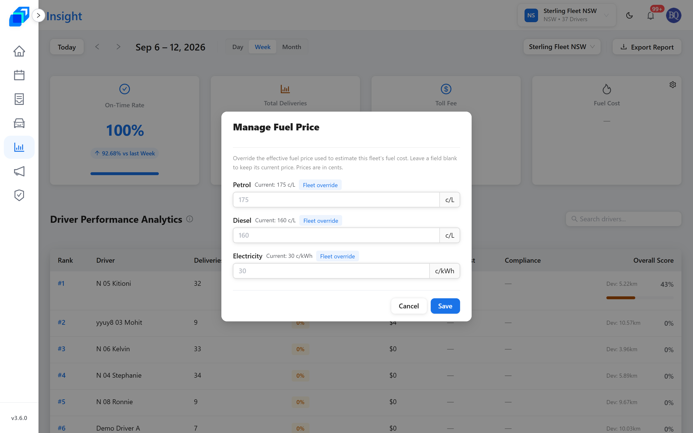
- Read the current price on each row. A tag says where it came from – Fleet override, AIP base or Manual. A row with no price reads No price set.
- Type your own figure on the row you want to change. Petrol and diesel are in cents per litre; electricity is in cents per kilowatt hour. Leave a row blank to keep its current price, and enter at least one figure.
- Click Save. A Fuel price updated message confirms it.
Your change takes effect straight away, and the fuel-cost figures on the page refresh with it.
Managing the fuel price is a separate permission from viewing this page. If the gear icon does not appear on the Fuel Cost card, ask your fleet admin to grant it.
Next steps
- Work a Run Sheet – where the deliveries counted here come from.
- A driver's record – open the record behind a name in the ranking.
- Why some menus are hidden (your permissions) – why the gear icon, or the whole page, may not appear for you.